Economic Research Landing Page Template
A two-column responsive template used for the Economic Research Landing page.
Resize window to see mobile.

-
Section Header
Wrap header with <header class="section-header">. Define section further with <h3> and <a id="section-header-er">; color is from class="economic-research". On scroll on desktop and tablet, JavaScript will affix header to top (with Menu and Search). (See scripts.js.) -
Main body
Below the section header, wrap the content with <div id="outer-content" class="wrap cf"> and with an inner wrapper <div id="inner-content">. -
Columns
Create two columns:
left with <article role="article" class="m-all t-all d-8of12 landing">;
right with <article role="article" class="m-all t-all d-4of12">. Right rearranges to bottom of page on mobile. -
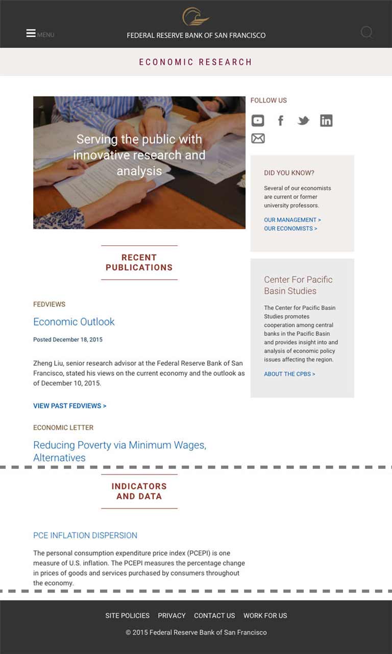
Hero image and text
Wrap with a <section> tag, then <div class="landing-hero">. Use <img class="hero"> for image and <p> for text.Sub-section styles
Contains links, publication titles, and teasers to sub-sections of ER. Use <header class="entry-header"> to wrap sub-section header link; style with <h2 class="landing-section-title">.
Wrap featured publications within sub-sections with <article> tag, publication title with <h3 class="landing-pub-title">. For the section to make sense visually, apply <h3 class="h2"> to the title link. Text will be in a <p>.View More or Related
Style View More link as <h4>, once for desktop with class "desktop" and again for mobile with class "mobile", which determines whether the link shows an arrow (right chevron or greater-than symbol).Social media
Wrap the social media container in a <div> of class="landing-follow-section desktop" to house icons and links to social media sites that ER uses.Related boxes
Wrap related boxes with <div> .landing-did-you-know class; additional info boxes with .landing-additional class.
Style header for primary box with <h3>; additional with <h3 class="heading-bg">.
Text in box is a <p>. Code links for additional info with a .mobile or .desktop class, which determines whether a link has an arrow (right chevron or greater-than symbol). On mobile, these boxes stack to the bottom of the page.