Our District Template
A one-column page used for Our District sub-landing page.
Resize window to see mobile.
-
Section Header
Wrap heading with <header class="section-header">. Define section further with <h3> and <a id="x">, where x = section header id; color is from section header class. On scroll on desktop and tablet, JavaScript will affix header to top (with Menu and Search). (See scripts.js.) -
Main and inner body
Below the section header, wrap the content with <div id="outer-content" class="wrap cf"> and with an inner wrapper <div id="inner-content">. Then wrap the inner body (one-column layout) with <article role="article" class="m-all t-all d-10of12 d-o-1of12">. -
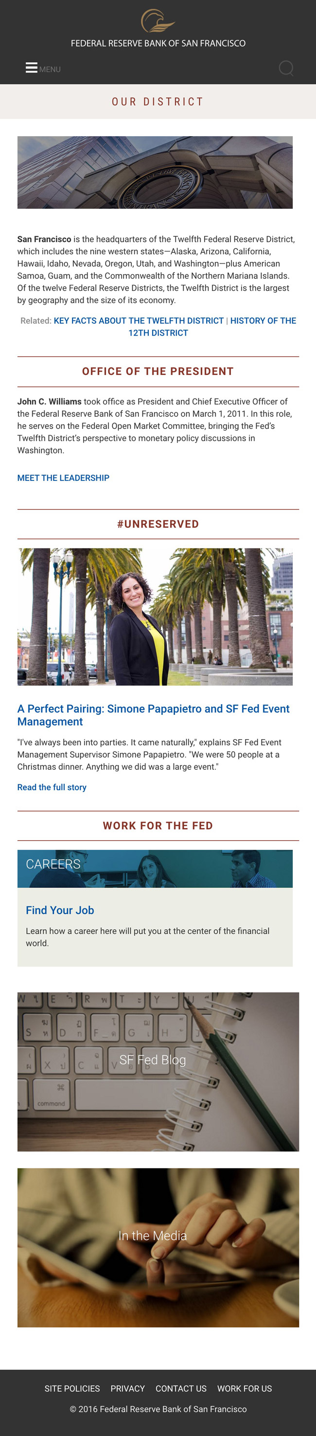
Hero image and text
Wrap image and text with a <div class="landing-hero-our-district">. Code header text with <p class="desktop"> (invisible on mobile); hero image with <img class="hero">. -
Text and related links
Use <p> for text. Style related links in this section with <p class="related">. (This is an important distinction, because this object is targeted through .page-our-district .related) -
Section links
Style with <h2 class="landing-section-title">. -
View more or related links
For the rest of the related links on the template, use <h4> class="related", and code them twice: one for desktop with class="view-more desktop", the link text ending with a right chevron or greater-than symbol (>); and for mobile with class="view-more mobile" with no chevron. -
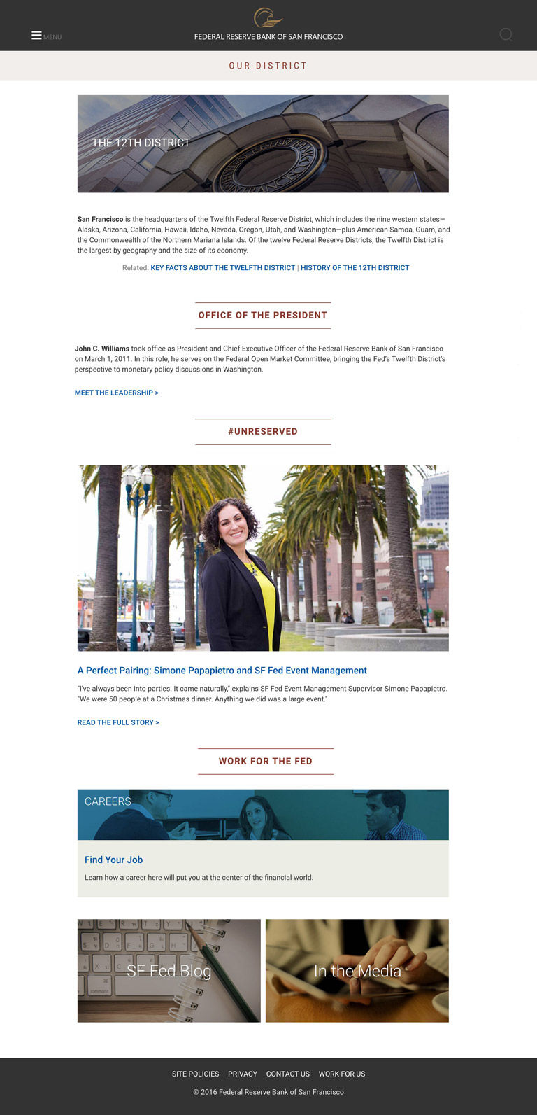
#unreserved image
Size the featured image, which is responsive, with natural dimensions of 960 x 480. -
Careers feature
Define the containing box with <div id="careers-highlight">.
Wrap the top section (image and text overlay) with <div class="landing-careers-our-district">. Use <h5> for Find Your Job heading. -
Blog & media image links
Code each container for image and text overlay with <div class="m-all t-6of12 d-6of12">. In the class tag, use "sf-fed-blog" for SF Fed Blog and "in-the-media" for In the Media image. Images have a natural size of 467 x 264; on mobile, they will stack.